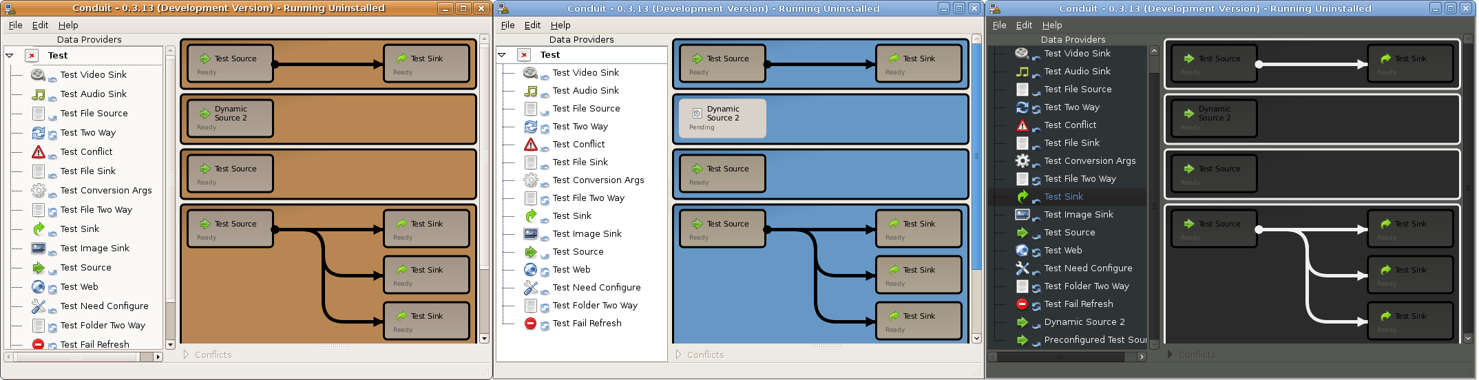
Thank you everyone for their constructive comments on my previous post. A number of posters suggested the rounded boxes that conduit uses to group dataproviders were too bold, unnecessary, or both. I would like your opinion on which of the following four choices is the most suitable as a replacement.
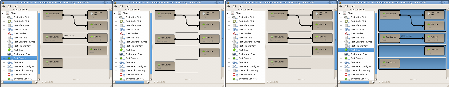 Which is the best; 1,2,3 or 4?
Number four is the current implementation. I am leaning towards the first option as a replacement. From testing it seems to look the most consistent on different themes, and I believe it is the most suitable background to place (future) drag and drop hints on.
The discussions regarding my proposal for inclusion of Conduit into GNOME 2.24 seem to be going OK. The inevitable issue of Conduit's user interface has been raised, and it is good to see some constructive comments being posted.
It is a bit of a simplification, but I see basically three schools of thought with regard to the user interface for synchronizing things. What follows is a brief discussion of the pros and cons of each approach.
-
Everything should be automatically configured, and the current Conduit user interface should cease to exist - synchronization functionality/UI should be put into the respective application, calling into Conduit over DBus.
-
While I agree in theory, there is a enormous divide between theory and practice. For the foreseeable future it is not going to be possible to auto-configure synchronization parameters for all mobile devices. This is in part due to quirks in the devices, and in part because its sometimes not possible to enumerate all the things that a device supports without first configuring/pairing/connecting/etc with it.
-
Many web services require a authorization step, either once per application, or once per session. To make this easier on the user, Conduit hosts its own web browser for showing the login dialog in a consistent manner. I believe that this is the least surprising result to the user, if they sync something in conduit, the authentication should be done in conduit, not in the users default web browser, where they may not immediately recognize that it is Conduit that requires the authentication. Until we get some more online-desktopy stuff into GNOME (sharing auth cookies, authenticating services, etc) I think our approach is a good one.
-
I think it is important to have a single, consistent interface for resolving conflicts, this is currently in the Conduit GUI, but perhaps we could export it over DBus, like we do for the configuration dialogs.
-
Doing everything in other applications, reduces Conduits power to the lowest common denominator of these applications. Some of the cool power of Conduit is in the synchronization partnerships you can create that are not even tied to an application. For example, its possible to configure a 'sync' from Youtube, onto your iPod, that downloads and transcodes videos from you favorite user/channel. In what app would something like that go?
-
The conduit GUI should be simpler once you have configured everything.
-
This is the approach I agree with the most. I think. This could potentially involve some sort of minimize/maximize type button that when pushed, would collaps the main canvas down into something like the iSync user interface.
-
While I quite like that approach, I would almost rather implement an entire second GUI using only the Conduit DBus interface. This is the approach being persued by Alexandre (SOC student working on iPod support), and by John Carr (for a simplified windows mobile experience)
-
It was also suggested to make configuration easier, we should try gtk.Assistant.
-
Redesign the entire UI
Redesigning the Conduit GUI
Today I decided to work on improving the current UI based upon some feedback on desktop-devel-list. First I spoke with my user interaction designer friend, and asked her what she thought. After 15 minutes of talking to an imaginary person that did not exist (any volunteers to be my interaction designer friend?) I decided to instead make some incremental improvements to the current UI. Some people may see this as re-arranging deck chairs on the Titanic, but hey, what have I got to lose?
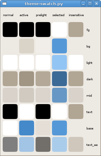
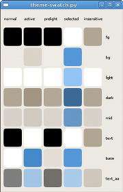
The first step was to use the current theme colors. After a bit of looking around, I couldn't actually find a simple way to see what these were, so I wrote a quick application that draws color swatches for all the theme colors, in each of the widget states. If anyone wants so play with it, the code is available from my git repository.
Rounded rectangles make anything pretty.
With an idea of what colors are actually present, I changed the Conduit and DataProvider colors to use sensible colors from the theme. I also implemented some subtle gradients to make things a bit more GNOME.
 Just kidding.
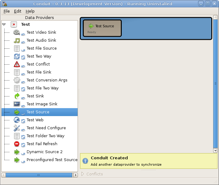
The result turned out pretty nice I think. This is the first time I have actually tried to make a custom widget match the user theme, and it was not too painful. One annoying limitation is that I only seem to get access to the matching style, but I would quite like to use colors from the tooltip style. It also gave me the opportunity to remove some UI clutter; I no longer show sources and sinks in different colors. Anyway the final result was;
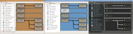 Beautiful in brown, blue and black.
When I said subtle I really meant it. I would really appreciate it if a talented artistic hacker had a look at the code, and experimented with some more creative gradient settings. The function in question is get_style_properties which lives in conduit/gtkui/Canvas.py, and is implemented in all CanvasItem derived classes.
I then moved onto experimenting with waking the user through the sync and configuration process. I did some experiments using the Gedit message area to suggest steps the user could take. Thanks to Colin and HotSSH for the widget. Im not sure about this one.
 Too much like Clippy?
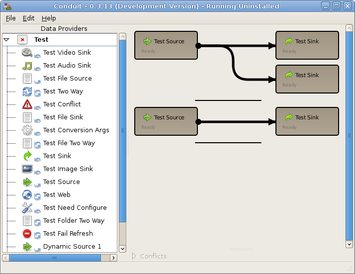
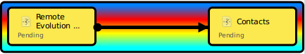
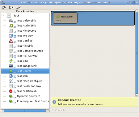
Mathias suggested a visible drop target. I think this will be my next challenge. I also did an example implementation showing what the Conduit UI would look like if the outer, grouping, rounded rectangle was removed. Now a simple line differentiates different between conduits. What do you think?
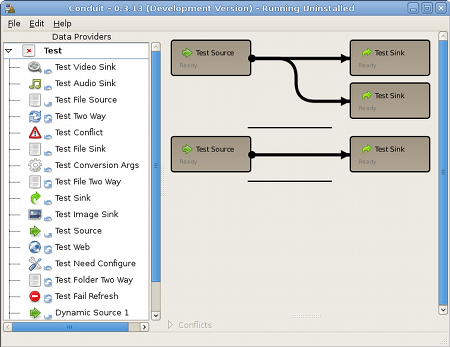 Now with 29% less rounded rectangles.
Summary
-
I'm pretty happy with the themed colors. The work is available in my bzr branch, and will make it to trunk soon
- bzr branch http://bzr-playground.gnome.org/~jstowers/conduit/devel
-
There is continued discussion regarding UI ideas happening on live.gnome.org
-
My Gtk theme swatch too is available from
- git clone http://gist.github.com/49799
-
There will be a Conduit UI, of some sort, for the forseeable future. Lets spend some time making it better!
Updates
 Which is the best; 1,2,3 or 4?