Conduit UI Experiments - Part Two
Thank you everyone for their constructive comments on my previous post. A number of posters suggested the rounded boxes that conduit uses to group dataproviders were too bold, unnecessary, or both. I would like your opinion on which of the following four choices is the most suitable as a replacement.
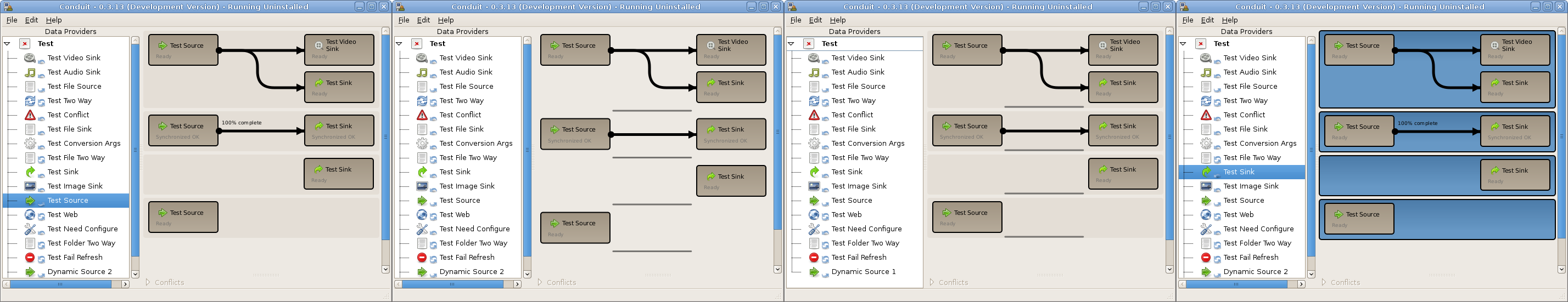 Which is the best; 1,2,3 or 4?
Number four is the current implementation. I am leaning towards the first option as a replacement. From testing it seems to look the most consistent on different themes, and I believe it is the most suitable background to place (future) drag and drop hints on.